Monday, August 20, 2012

Studio Visit: Theresa Anderson

August 20, 2012


STUDIO VIST:  THERESA ANDERSON


“This book first arose out of a passage in Borges, out of the laughter that shattered, as I read the passage, all the familiar landmarks of my thought—our thought that bears the stamp of our age and our geography—breaking up all the ordered surfaces and all the planes with which we are accustomed to tame the wild profusion of existing things, and continuing long afterwards to disturb and threaten with collapse our age-old distinction between the Same and the Other. This passage quotes a ‘certain Chinese encyclopaedia’ in which it is written that ‘animals are divided into: (a) belonging to the Emperor, (b) embalmed, (c) tame, (d) suckling pigs, (e) sirens, (f) fabulous, (g) stray dogs, (h) included in the present classification, (i) frenzied, (j) innumerable, (k) drawn with a very fine camelhair brush, (l) et cetera, (m) having just broken the water pitcher, (n) that from a long way off look like flies’. In the wonderment of this taxonomy, the thing we apprehend in one great leap, the thing that, by means of the fable, is demonstrated as the exotic charm of another system of thought, is the limitation of our own, the stark impossibility of thinking that.”

I have always loved this passage that launches the preface to Foucault’s seminal post-modern work, The Order of Things.  It describes so elegantly the enormous project of our post-modern era, which is to play out the exhaustive battle that must inevitably be waged between the rigid finality of rational classification and the subversive ambiguity of its various alternatives.  Few fields have expressed the convulsions of this conflict more strikingly than the arts.  Its tremors have permeated the artistic production of innumerous artists since even before Foucault first penned these words, and they continue to be the underlying momentum that feeds much of the most interesting art practices today.  


Theresa Anderson is an emerging Denver artist who is finding a place for her work within the theoretical framework of this conflict.  Her style, which she has cunningly self-labeled “punk-feminism,” is characterized by busy installations of multi-media amalgamations.  Running the gamut from flattened and fragmented figurative paintings that strongly evoke the proto-Pop Art canvases of Larry Rivers to Rauschenberg-esque combinations of found objects; her work strives (at times quite self-consciously) to defy definition.  The artwork in her most current installation (a collaboration with Rebecca Vaughan) deals deliberately with the ranking of everyday objects.  The exhibition, titled “SWANK [fool]” opened Friday at Ice Cube Gallery.  We met with Anderson in her studio one sweltering afternoon some weeks ago to discuss the work in progress.  The following is an abbreviated version of that interview:


Wednesday, July 18, 2012

Tyler Beard at Robischon

Well, it has been a few months since we have posted.  Libby spent 2 months doing a residency at Platte Forum in the spring (a post about this is soon to come) and Brandon has been busy this summer teaching a high school summer class titled "How to Survive the Zombie Apocalypse."  Between fighting off zombies and making art, we haven't had much time to type.  

Nonetheless, we made a short trip to Denver earlier this month to see some artwork and chat with Theresa Anderson (our interview with her will be posted on the Street Meet page soon).  While in the city, we came across the work of a most interesting young Dever artist, Tyler Beard.  Tucked away in the Viewing Room of Robischon Gallery's recent "Material Abstraction" Show, we found an astounding collection of Beard's collages and wacky assemblages.  Wavering somewhere between geometric abstraction and nature diorama, his works conjure the possibilities of a modern-day Joseph Albers trapped in a Discovery Channel Store. We were honestly blown away! 


Thursday, February 9, 2012

Recalcitrant Mimesis at David B. Smith Gallery

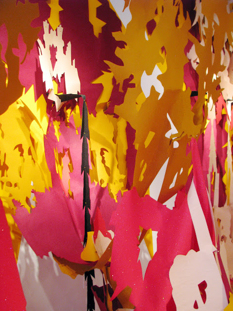
We may have been skeptical about the new Clyfford Still Museum, but about the Liz Miller exhibition at the David B. Smith Gallery that Still’s work inspired, we are not. Miller uses cut paper and felt to create intricate pieces that walk a thin line between 2-dimensionality and 3-dimensionality, order and chaos, and delicacy and strength.

Taking Still’s bold and colorful abstract paintings as a point of departure, Miller has created a breathtaking installation that stands more than solidly on its own.   Consisting of giant pieces of cut felt that have been stretched and folded into bold ranges of color and intricate crevices and cavities, Miller’s installation spans the length of one wall of the gallery from ceiling to floor and creates an immersive environment that pulsates with chaotic energy.   The opposite wall is filled with plexi-glass boxes displaying labyrinthine paper constructions that at once invoke choreographed explosions, absurd Mardi-Gras masks, and un-identifiable solar bodies. The originality and meticulous execution of this work makes Recalcitrant Mimesis a must see.  The show is on exhibition at the David B. Smith Gallery through February 18.


More images of the work on show can be seen at the David B. Smith website.

On a side note...
Liz Miller’s artwork made us think of one of our favorite artist, Leslie Shows, whose large cut paper installation was exhibited at the Yerba Buena Center for the Arts in San Francisco in 2009.  Check out some pictures of the piece and watch a short video about this amazing artist:
Leslie Shows "Dispay of Properties"


Leslie Shows "Dispay of Properties"

Leslie Shows "Dispay of Properties"

Leslie Shows "Dispay of Properties"


Sunday, February 5, 2012

Clyfford Still Museum- For Better or For Worse


Well, we finally made it to Denver’s newest major art museum.  Designed as a one-man shrine to the hugely influential and yet largely elusive abstract expressionist, the Clyfford Still Museum opened with much fanfare in December.
Clyfford Still Museum

Though it feels a bit irreverent to poo-poo any development in Colorado’s art offerings, we must admit that we have consciously put off this visit as long as we possibly could in hopes that we might be able to avoid publicly airing our less than enthusiastic sentiments.  Trust us, these thoughts do not come without a great deal of guilt; and here we must confide that we are looking over our shoulders and whispering nervously like children hatching an evil scheme as we write.  It’s not that we aren’t excited to have a large, expensive, and well-hyped new museum in town.  And, we certainly don’t HATE the thing- especially not the way that 36 year-old Carmen Tisch does.  In early January, Tisch was arrested at the museum after causing $10,000 worth of damage to a large iconic painting titled “1957-J-No. 2” by beating it with her fists and then pulling down her pants and rubbing her behind against the canvas just before falling on the floor and urinating on herself.  Wow- now that’s some hate!
Clyfford Still, 1957-J-No. 2
  
No, no, we certainly don’t hate it.  Maybe it’s best to say that the whole thing just leaves us feeling a bit ambivalent.  Still is unarguably one the most important American artists.  He played an instrumental role as an early pioneer of Abstract Expressionism, the art movement that put American artwork on the map in the 1950s and that contributed greatly to the creation of a distinct American artistic identity in the post-WWII period.  Still began developing his iconic style early in the development of the Ab-Ex movement and his large color-field paintings rival in beauty and importance those of Mark Rothko, Barnett Newman, and Hans Hoffman.  

Despite its historical importance and theoretical contributions to subsequent art movements, Abstract Expressionism has long been criticized by feminist and post-colonial critics for its elitist and patriarchal perspectives; and much writing has been dedicated to the machismo displayed by many of its male practitioners.  In many respects, Still may have lived up to the elitist and pretentious stereotype of the male Ab-Ex artist.  Despite his influence, Still became critical of the commercial art world soon after his rise to prominence and remained throughout his life fairly isolated from the larger Ab-Ex movement.   He was extremely selective in showing and selling his artwork; only allowing about 6% of the work to ever be sold, and refusing to participate in any public exhibitions between 1952 and 1959.  He also became increasingly insistent that his artwork should only been seen in highly specific contexts; and especially insisting that his paintings be seen solely with other Clyfford Still paintings. 

Upon his death in 1980 Still’s estate, which contained approximately 94% of his life’s production, was closed off to researchers and the public.  His will stipulated that the estate would be gifted to any city that would build a museum dedicated to the research and display of solely his artwork.  All of this leaves us in a bit of a conundrum.  Should the extraordinary emphasis that Still placed on the viewing context of his artwork be seen as the manifestation of a self-indulgent megalomaniac or as a brilliant precursor to contemporary concerns with immersive environments and site-specificity?  While Still’s work certainly has historical importance, does his work have enough contemporary relevance to merit the enormous financial investment that was required to realize this project?  And finally, while the museum holds an enormous collection, how long can a museum that displays only one man’s artwork really keep the viewer’s attention?  If you are a lover of Clyfford Still’s work, perhaps indefinitely; otherwise, maybe a visit or two will do.   


Saturday, January 7, 2012

We love Rube Goldberg machines!

Well, this doesn't necessarily have much to do with contemporary art in Colorado, but after seeing the amazing Rube Goldberg machines of Joseph Herscher on the New York Times website this morning, we decided that we just couldn't resist creating a little mini-post featuring a few of our favorite Rube Goldberg machines.  If only all of our household appliances could perform their functions in such a excitingly complicated manner!
       Joseph Herscher, The Falling Water
For a link to the New York Times article about Joseph Hersher, click here.
For for a video featuring Joseph Hersher's machines on the New York Times website click here.

For a link to a Wikipedia article on the mad cartoonist, Rube Goldberg, who started this whole thing, click here.

Our all-time favorite OK Go music video, titled This Too Shall Pass featuring one unbelievably rad Rube Goldberg machine:
For a link to an article on Wired Magazine's website about how the machine was built, click here.

MIT artist in residence, Arthur Ganson, is one of our absolute favorite artists and makes artworks that teeter somewhere between Rube Golberg Machines and kinetic sculpture (and often are both).

    Arthur Ganson, Faster!
Definitely check out his website here.

And of course, you can't even begin to talk about Rube Golberg machines without mentioning Peter Fischli and David Weiss' 100 ft. burning, spilling, rolling monstrosity titled Der Lauf der Dinge (The Way Things Go).  A legal film of the machine is, to our knowledge, unavailable on the Internet, though cuts of it can be found on YouTube.  However, any good art library should have a full length copy.  It really is required viewing for anyone interested in contemporary art.
Click here for a link to Fischli and Weiss on the Matthew Marks Gallery website.


Thursday, January 5, 2012

They were here, but now they're gone.

We just couldn't resist writing a little about two Denver shows that closed recently but are certainly worth mentioning:


Robert Adams "The Places We Live" at the Denver Art Museum
First, is the retrospective exhibition by Colorado photographer Robert Adams titled "The Places we Live" which was on view at the Denver Art Museum September 23-
January 1.   This quite expansive exhibition  presented an impressive representation of Adams' understated, at times saddening, and often devastatingly beautiful photographs.  The show offered a range of Adam's subject matter, including a collection of ocean photographs, a series of photos taken over the course of several years of a single cottonwood tree near Longmont, CO, and various images of Colorado's ghostly small towns.  The most impressive images were those that exhibited what Adam's does best- create beautiful, subtle portraits of the tenuous relationship between people and the environment they inhabit.


The show, unfortunately, is over.  However, Adam's photo books are available in bookstores and should not be overlooked by any resident of this land.  The most recently published of Adams' books is a photographic retrospective of the same title as the DAM exhibition.  A couple of our other favorites are Robert Adams:  The New West and What We Bought:  The New World, Scenes From the Denver Metropolitan Area, 1970-74.  There is also a great episode of the PBS contemporary art series, Art 21, that features Robert Adams.  Click here for a link.


Robert Adams
‘Colorado Springs, Colorado’1968
gelatin silver print
Yale University Art Gallery
Purchased with a gift from Saundra B. Lane, a grant from Trellis Fund, and the Janet and Simeon Braguin Fund


Chris Antemann and Kendrick Moholt's "Let Them Eat Cake" + Terry Maker and David Zimmer at Robischon Gallery
The second show that we saw recently in Denver and thought was worth mentioning is the exhibition that was on view at the Robischon Gallery from November 10 to December 31.   This multi-room exhibit contained the works of several interesting artists.  Three of them particularly tickled our fancy


The main gallery was dedicated to ceramicist Chris Antemann and photographer Kendrick Moholt's collaborative effort, titled "Let Them Eat Cake," a series of color photographs that presented carefully framed vignettes made up of Antemann's provocative porcelain figurines.  Reminiscent of the sexual (and financial) frivolity presented by 18th century Rococo painters such as Watteau, Antemann's delicate and luxuriously adorned figures twist, taunt, and flirt in provocative sensual tension.  Intricately detailed porcelain fetes complete with hand-decorated dishes full of delectable fare and naked, or nearly naked intertwined merrymakers reveal improprietous trysts and a frivolity that in today's economic situation can only seem immoral at  best.  Even without considering the show's title, "Let Them Eat Cake," the unmistakable link between the excesses revealed in these 18th century vignettes and those outrageous luxuries enjoyed by today's elite couldn't be missed.  The amazing attention to narrative and visual detail allowed us to overlook the fact that these 18th century characters left us a bit hungry for a little more concrete contemporary connection.  Moholt's color photographs framed these porcelain figures in fashion-ad like style; only heightening the vanity and sexual tension, and bringing particular attention to individual interactions within the larger composition of the three-dimensional object.  We think that this collaboration between Chris Antemann and Kendrick Moholt is worth a look.  Click here for a link to images of the show on the Robischon Gallery website.  Chris Antemann's website can be found here

Chris Antemann and Kendrick Moholt, Tea Party
Displayed in the adjacent gallery spaces was the work of Colorado artists Terry Maker and David Zimmer.  Terry Maker's cast resin suitcases had a childhood fantasy-like attraction that we just couldn't resist, while David Zimmer's mad-scientist video constructions were so cool they left us wanting more. 
                               
Terry Maker, Ascension (Boy)                                                                       
To see images of Terry Maker's work on the Robischon Gallery website, click here.  For a link to her website, click here


David Zimmer, Blue Bird Box
To see images of David Zimmer's work on the Robischon Gallery website, click here.  For a link to a February, 2011 Westword story by Susan Froyd about his work, click here.


Tuesday, January 3, 2012

West of Center at Denver's MCA


Last week, we took a much needed post-holiday trip to Denver.  Between stops at Great Divide Brewing Company's tap room and some rediculously fun, though horrifyingly clumsy ice skating at Denver's downtown outdoor skating rink, we found time to look at some art.


Our out and out favorite is the MCA show "West of Center- Art and the Counterculture Experiment in America, 1965-1977."  Maybe our current residence in the mountains of Southern Colorado, right at the center of the 1960s-70s Colorado counterculture hubbub, makes us predisposed to having tie-dyed fantasies of utopian societies swirling in our heads.  But we don't think it is just that. 


Co-curated by Elissa Auther (associate professor of contemporary art at th University of Colorado, Colorado Springs) and Adam Lerner (director of the MCA), "West of Center" provides an engaging and perhaps even ecstatic glimpse of the social, cultural, and artistic innovations of the couterculture movement of the 1960s and 70s.  The exhibition focuses largely on countercultural experiences and production of the West, and has particular relevance to Colorado- dedicating one full gallery to Drop City (an art commune located near Trinidad) and containing many references throughout the show to various other Colorado counterculture manifestations.


Fabric-covered dome on which archival video of Drop City is projected.
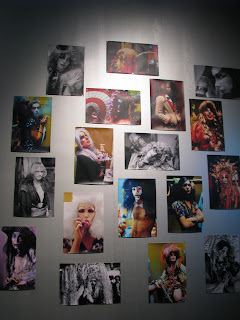
In total, the exhibition contains 6 sub-themes, including "Social Encounters: the Dance of Anna Halprin," "Dome Architecture: Drop City and Beyond," "Political Graphics: The Posters of Emory Douglas," "Feminist Collectives: Womyns Lands of Southern Oregon," "Nomadic Experiments: Ant Farm Inflatables," and "Life Theater:  The Cockettes and the Angels of Light;" as well as a fabulous one-off video production made specifically for the MCA by the now no longer existant goup The Single Wing Turquoise Bird, and an interactive presentation of The Ultimate Painting, a psychodelic spinning canvas that was created around the time of the conception of light shows to be used during multi-media productions in Drop City's Theater Dome.


                        Video of The Ultimate Painting from Drop City


Some themes recieve more attention in the show than others, but overall the presentation is well conceived and admirably constructed.  In this exhibition, construction and display are critical conveyors of content.  In the Ant Farm gallery, a large inflatable into which visitors are invited to roam and onto which archival Ant Farm video clips are projected, coupled with a full sized model of an Ant Farm bus and a large layout of Ant Farm's "Truckstop Network" drawings (Click for a link to a small blurb about Ant Farm from Cabinet Magazine)lend the visitor a temporary lapse of skepticism and allow one, if only momentariy, to imagine a world in which existing infrastructure could be manipulated to truly meet the spiritual, intellectual, and aesthetic needs of the people.  


Photo from inside the inflatable.  (I don't know why the hell I am flapping my arms around like that, but this was the only picture that turned out.)

Sitting inside the inflatable on bean bags watching the video projected on the "wall" of the inflatable.


Worth noting for its particular relevance to contemporary art/film practices is the Single Wing Turquoise Bird film Invisible Writing, 2011. Single Wing Turquoise Bird, a collective of Los Angeles artists and filmakers who performed improvisational light shows during the late 1960s and early 1970s, both independently and in accompaniement to large musical acts such as the Grateful Dead, produced Invisble Writing specifically for the MCA.  Presented as a single looping film in the gallery, this piece does not perhaps best exemplify the typical productions of Single Wing Turquoise Bird, which, presented live, were constructed through the overlapping imagery from multiple projectors using slides, strobes, films, and projections of dishes of colored oil and water.  In contrast to the composed composition of Invisible Writing, the more typical work of Single Wing Turquoise Bird is typified by its live and improvisational character.  None the less, Invisible Writing is a beautifully intricate piece and  provides a sufficient representation to gallery go-ers of the the group's work.  


What struck us as particulary sagacious about the inclusion of Single Wing Turquoise Bird in this exhibition is the group's apparent precursory link to various contemporary film practices, including the quickly-growing artform known as datamoshing.  Datamoshing, which utilizes the limitations of digital technologies to create visual filmic distortions, shares many characteristics with the light shows of the 1960s and 70s- most obviously in its use of overlapping and distorted imagery, but additionally in its often improvisational quality, and the occassional inclusion of live performances and musical components.  For an introduction to datamoshing click here.  To see some amazing examples of datamoshing by artist Takeshi Murata click here.  

               
                      clip from Invisible Drawing, Single Wing Turquoise Bird


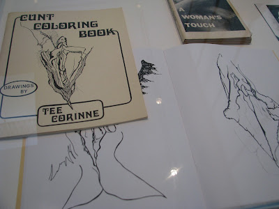
Not all of the philosophies or artistic productions presented in "West of Center" seem quite so relevant to contemporary issues; and some, such as the "Cunt Coloring Book" displayed in the section of the exhibition dedicated to feminist collectives, seem outright wacky.  But, "hey man" it was the 60s and 70s.  Considering the events of the last few years, maybe we could use a little counter-culture energy.  Maybe that's what the Occupy Wallstreet folks think too.  


"West of Center" is on view at Denver's MCA through February 19 and will travel to the Scottsdale Museum of Contemporary Art, the Jordan Schnitzer Museum of Art at the University of Oregon, Eugene and the Mills College Art Museum.  We think you should give it a look.


"Cunt Coloring Book"


A toy that utilizes geometric forms

Photos of The Cockettes and The Angels of Light
Display of photos of Drop City